Try These 5 A/B Testing Examples on Your Apartment Website Today
Your multifamily website is one of the most important marketing tools you have at your disposal. It’s the first place many potential residents will go to learn about your property and what you have to offer.
That’s why it’s so important to make sure your multifamily website content and branding are as effective as possible.
A/B testing, also known as split testing, is a method of comparing two versions of a web page to see which one performs better. The idea is to test different versions of your site against each other to see which one produces the desired result, whether that’s more tours and leases, more newsletter sign-ups, or more social media shares.
You can A/B test just about anything on your apartment website if you have the traffic to support it. But, some things are easier to test than others. Here are a few ideas:
1. The color of your call-to-action button
One of the most important elements on your multifamily website is your call-to-action (CTA) button. This is the button that you want prospective residents to click on in order to book a tour or sign up for your resident newsletter.
The color of your CTA button can have a big impact on how effective it is. Different colors can evoke different emotions and reactions. For example, red is often associated with urgency and excitement, while green is associated with calm and reassurance. Testing different colors for your CTA button is a quick and easy way to see if you can increase conversions on your property website.
2. The copy on your call-to-action button
The copy on your CTA button is also important. This is the text that appears on the button itself, and it needs to be effective in order to get people to click.
Testing different versions of your CTA button copy is a great way to see if you can increase conversions on your multifamily website. Your CTA button copy should be clear, concise, and persuasive. It should tell people what they need to do (click the button) and what they’ll get out of it (a private tour at your property).
What does your CTA button say currently? Is it a simple “BOOK A TOUR” text or “Contact us to book a tour today!” Is the text in all caps or title case? Try out longer and shorter CTA button text and test out using all caps versus title case or sentence case options. These small changes can go a long way to increasing conversions!
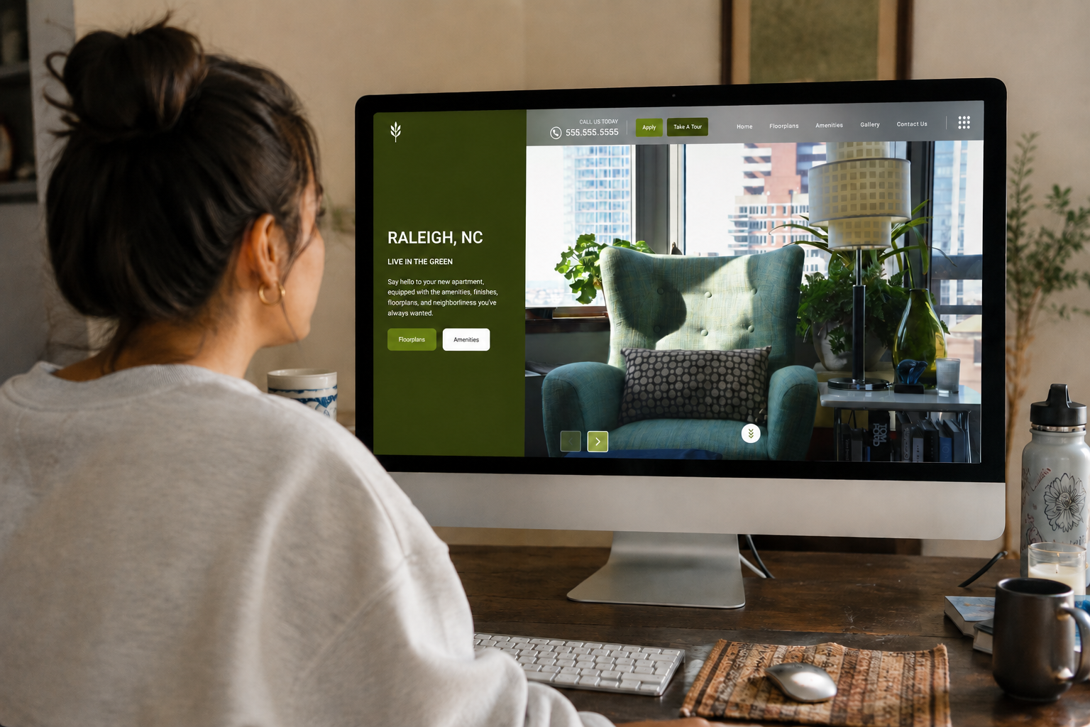
3. The position of your call-to-action button
The position of your CTA button can also have an impact on its effectiveness. If people can’t find the button, they’re not going to click on it. Where is your CTA button located currently? Is it in a sticky nav at the top of the page? Is it in the hero image area above the fold? Is it located on the bottom of the page?
This should seem simple, but shockingly enough, a lot of properties don’t do it well. How can a prospect get in touch? Don’t make people jump through hoops — instead, make it easy and eliminate friction in the buying process by making your CTA button easy to find.
Then, test out different positions and placements for your CTA button on your homepage to see if you can increase leads, tours, and leases. If you haven’t already, start by testing out the CTA button position by putting it somewhere above the fold (toward the top of the page), then every other week, test out a new position and compare your web analytics to see if the movement made a difference!
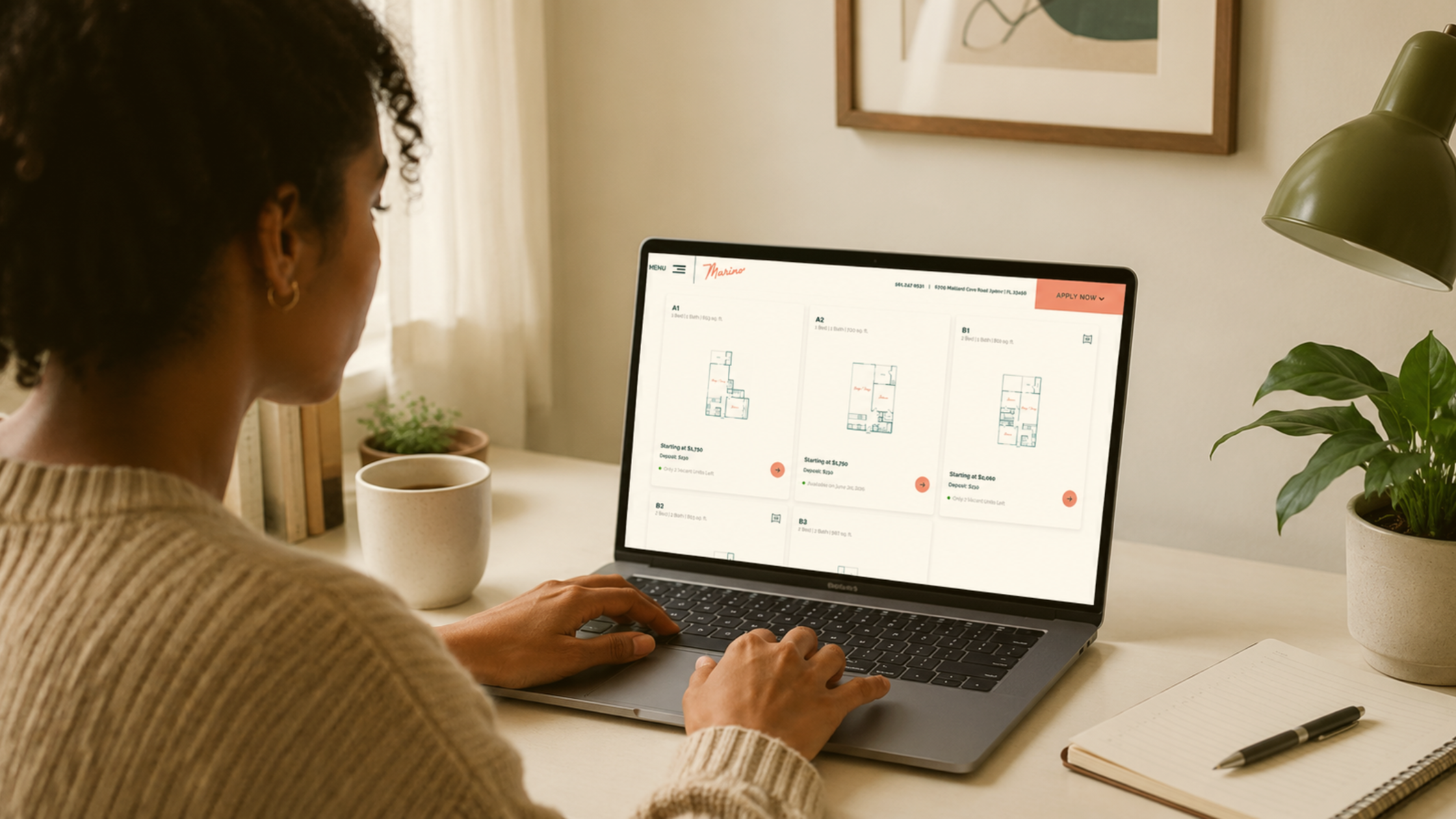
4. The design of your floorplans and pricing subpage
Your apartment web design is another important element to earning more conversions, particularly the design and layout of your floorplans subpage. This is the page where prospective residents go to learn about your floorplans, starting monthly rent, and choosing the layout that’s right for them.
The design of your pricing and floorplans page can have a big impact on how effective it is. Different designs can evoke different emotions and reactions. For example, a simple and clean design might be seen as more trustworthy, while a complex design might be seen as more exciting.
The goal is to test out different design elements to persuade the prospect to stay on the page for longer and encourage them to click on your “book a tour” or “book now” call-to-action button.

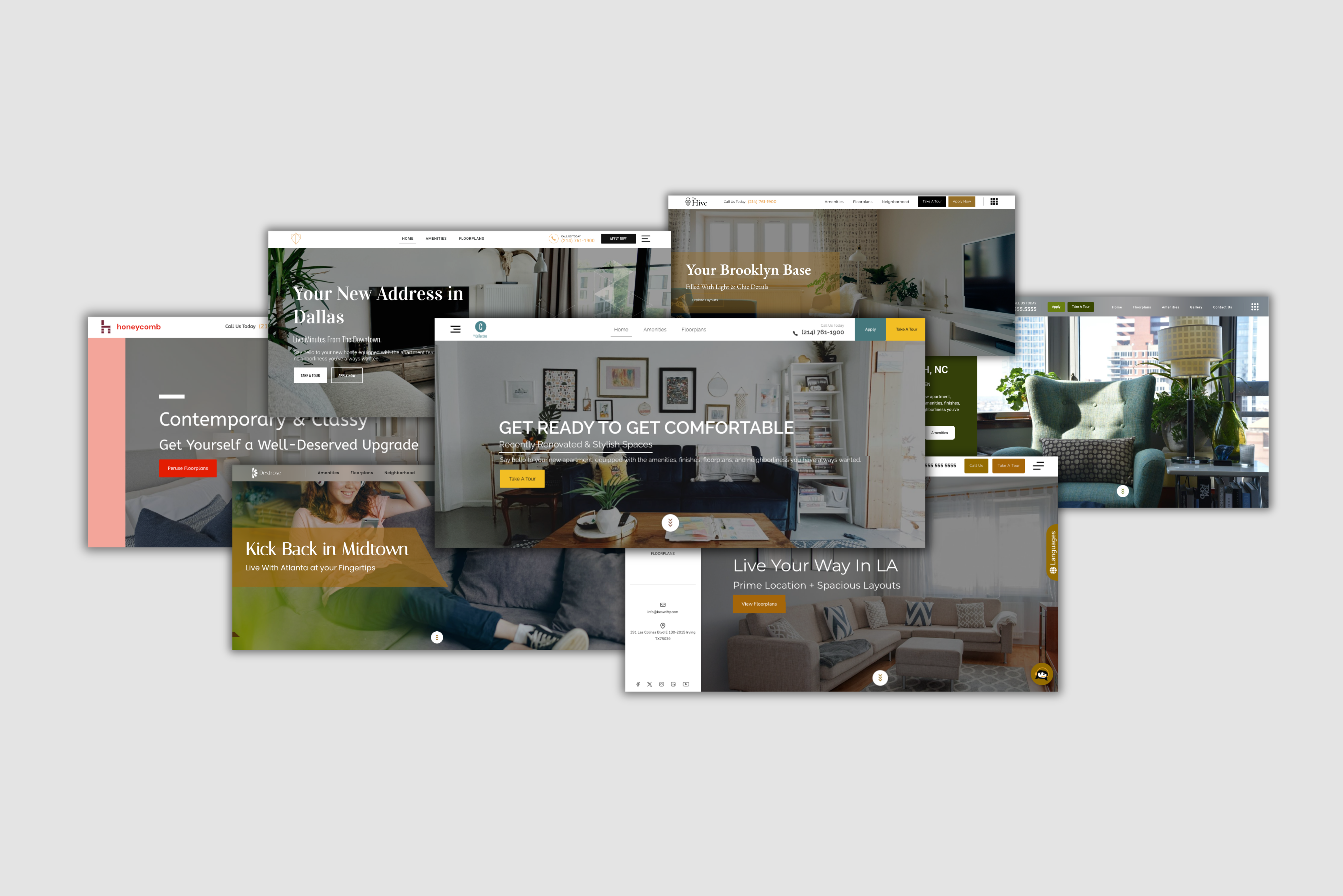
p.s. If your apartment web design isn’t designed to convert, Swifty’s premium apartment web themes are here to help! Explore some of our many design options and create a free account on our site to learn more about the many benefits we offer.
5. The copy on your floorplans and pricing page
The copy on your pricing and floorplans page also plays a critical role in conversions. This is the text that appears on the page itself, and it needs to be effective and persuasive in order to get people to convert.
Your content should be clear, concise, and engaging to set yourself apart from the competition. It should explain your available floorplans and pricing options in a way that is easy to understand and make it clear why your property is worth the price. Take your residents on a journey by clearly explaining the benefits of your floorplans and making it super simple for the prospect to find what they need.
Small Changes Can Make Big Impact
A/B testing is a powerful tool that can help you optimize your website for conversions. By testing different elements on your website, you can find the best-performing version and make it the standard.
If you’re not sure where to start, try A/B testing one of the elements on this list. You might be surprised at how big of an impact a small change can make. And keep in mind that you should only make one change at a time for the best results. Making more than one change on a page at a time can skew your analytics and make it more difficult to determine which of the changes impacted your web traffic, leads, and conversions.