3 Reasons Why Your Multifamily Websites Aren’t Landing You Apartment Leads
When it comes to your apartment web design, the process can be challenging.
Multifamily branding can be a long, drawn-out, and even difficult process. Time and time again, properties get caught up in the unproductive cycle of design and redesign, negatively impacting their results and bottom line.
With this in mind, we’ve come up with a number of obstacles you might face when working on multifamily branding and how to overcome them.
Obstacle #1: Your apartment web design isn’t user-friendly.
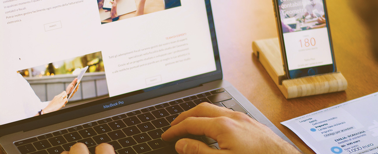
Having a user-friendly multifamily website is one of the most important aspects of apartment web design. Every Call-to-Action button, subpage, image, shape, and line should keep the user in mind.
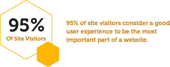
A study found that 95% of visitors consider a good user experience to be the most important part of a website. Your site should be easily navigable for all visitors, all the way down to the type of font used.
If a prospective resident is unable to navigate through your multifamily website, they will likely leave just as quickly as they came. Residents and prospects alike should be able to find all the information they need, and it shouldn’t take them more than a second to navigate to your amenities page or view your property image gallery.
The Solution: Pretend you are a prospective resident visiting your website for the first time. Scroll the homepage and time yourself to see how quickly and easily you are able to find things like floorplans, amenities, and images of the property. Click through to book a tour to ensure the process is as seamless as possible. Take notes on what was difficult or took more time than expected to navigate so that you can make adjustments and improve your apartment website’s usability.
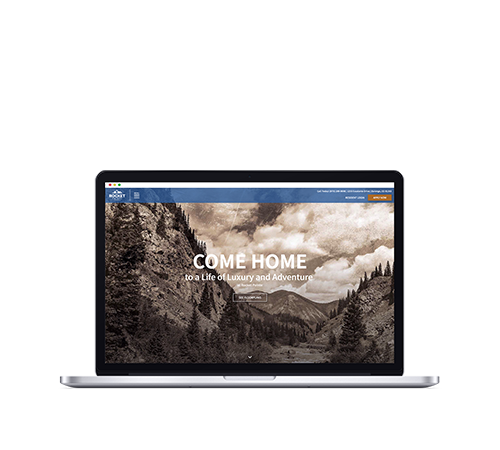
Need some help creating a user-friendly site? Swifty’s pre-designed apartment web design themes feature clean lines, large display areas for photography, and contemporary design, making it easy for residents to navigate and receive the information they need to make a purchasing decision. Each web theme’s simple structure yet exciting scroll creates a user-friendly exploration of what your property has to offer.
Obstacle #2: Your multifamily website loads slow.
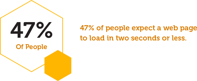
According to The Aberdeen Group, 47% of people expect a web page to load in two seconds or less.
A one-second delay in your page load time could equate to 11% fewer page views and 7% fewer conversions. Plus, loading speed can even affect your multifamily SEO and rankings.
When it comes to your apartment web design, every second counts.
The Solution: Whether it’s desktop or mobile, make sure your page loads completely in under two seconds by reducing redirects, avoiding the use of too many plugins, and optimizing your images.
If you’ve got the need for speed, Swifty is your easy and efficient solution. Our team has been busy performing multiple speed tests to ensure your apartment web design operates at the highest efficiency.
Obstacle #3: Your multifamily website is unattractive and outdated.
You can have the fastest-loading multifamily website that’s incredibly user-friendly, but if it’s outdated and unattractive, you aren’t doing yourself any favors.
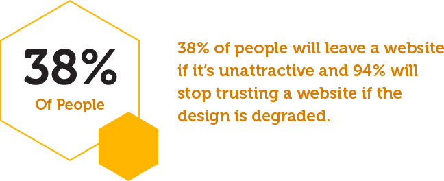
In fact, 38% of people will leave a website if it’s unattractive, and 94% will stop trusting a website if the apartment web design is degraded.
Put it this way, if your multifamily website is outdated, prospective residents will likely think your property is too. In today’s environment, leasing sight unseen is necessary amid social distancing measures. An attractive website could mean the difference between one lease and many.
The Solution: Take a look at your competitor’s websites. Look at several different multifamily websites and compare the features to your own. If their apartment web designs have a more dynamic design and features not shown on your website, it’s time to upgrade.
Here are a few things you’ll want to avoid in your apartment web design:
- Cluttered layout
- Pixelated or outdated imagery
- Too much text
- Large chunks of content without images
- Broken links
Tired of bumbling around with your apartment web design, trying to make it modern and attractive? With Swifty, we can quickly launch or update high-end, fast, and SEO-friendly sites for each community in your portfolio at a fraction of the cost and time of custom-designed websites.
You can use the same multifamily website theme for consistency across all properties while interchanging the branding, photography, and font to make each site feel unique. You can also easily switch between any of our themes without losing content or messing up your settings.
Avoid Apartment Web Design Pitfalls With Swifty
In order to attract, convert, and retain residents, your apartment website must be engaging, beautifully designed, and elicit an emotional response from the renter.
If your web design is unappealing, your site loads too slowly, and you have a complicated user interface that is difficult to navigate, the likelihood of signing new leases is significantly lower.
