How to Set Your Multifamily Website Up for Success
Last year was a great time for apartment web design. Advances made in web typography, layout models, and a focus on function and form created new challenges and intriguing solutions for designers.
Now that 2022 is here, the big question is, “What’s next?” So, it’s time to put on our prognostication hats and figure out what’s in store for apartment web design this year.
1. Storytelling
Sure, there’s always going to be a place for the pure informational multifamily website or the old-school “brochure” website. But telling a compelling story has really become paramount in apartment web design, and we’re finding new and exciting ways to do that every day.
With continued updates to the Google algorithm and how your copy impacts search ranking, the importance of web copywriting and layout for large amounts of text will increase this year. As such, designers will be able to treat web layouts even more like editorial layouts than before.
2. Simplicity
Flat design continued to evolve last year. Combine that with the users of the world demanding faster, more intuitive layouts on their handheld devices, and it’s easy to see how simplicity will rule 2022. All elements of a multifamily website will need to have some sort of useful function to justify its inclusion on a page, which should be seen as a very fun problem for designers to sort out.
One mistake many businesses make is trying to include too many elements on their websites. Prioritize the basics, make sure your site is user-friendly and functional, then add in one or two creative and dynamic elements. By jumping straight in with a dozen different scrollers, animations, color contrasts, carousel sliders, and other elements, your site loses focus on what’s most important and can cause users to bounce from the page quickly.
3. Contrast Colors
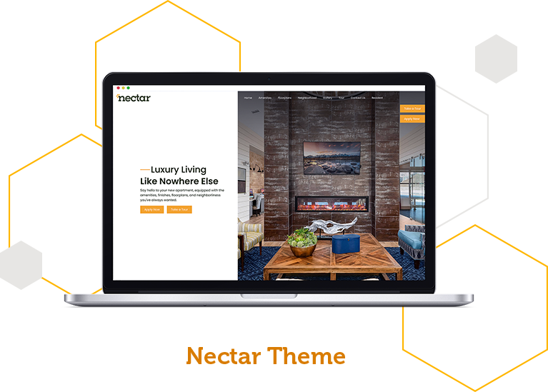
Web designers have never been afraid to use a lot of colors. Many even use it well! But 2022 is going to continue to be a year of intentionally limited color palettes. One- or two-color designs, when done correctly, are just as compelling as bright multicolor layouts. You could definitely make the argument that a well-considered monochromatic site with just a pop of color here and there for impact is even more compelling by virtue of its severity.
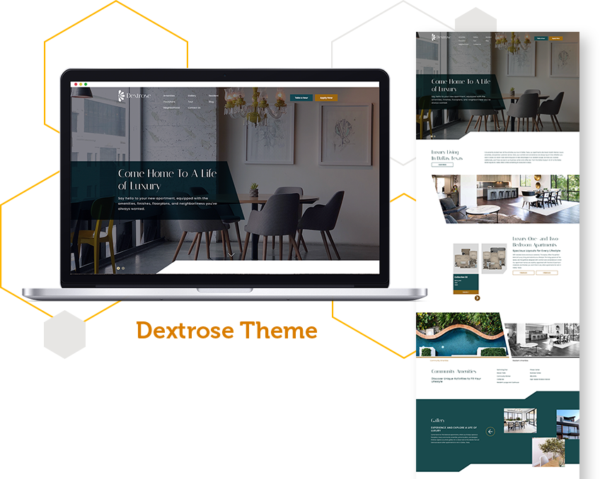
Many of our Swifty apartment web designs feature a clean design with one or two contrasting colors incorporated into the page. This layout is easier on the eyes and helps keep your page visitors more focused on the content and images on the page, rather than too many bright and distracting colors.
4. Large Typography
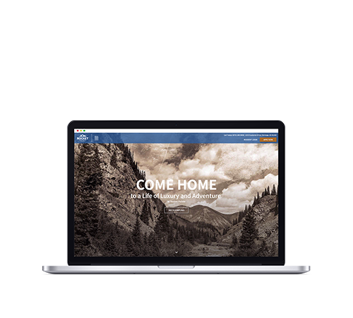
Even if you don’t have a Typekit account with Google Fonts sitting right there for everyone, there’s no excuse for your site to have boring typography. Now that it’s no longer considered a cardinal sin for sites to have big bold blocks of text, the envelope is being pushed by forward-thinkers who understand that a well-rendered bit of gigantic type in a great typeface is a fantastic design element. Look to see more of that this year.
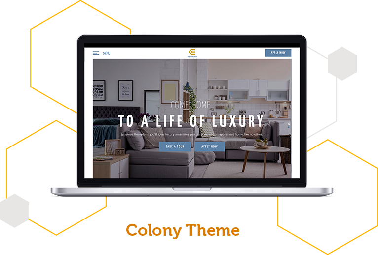
Did you know all of our Swifty premium apartment web designs feature bold typography in the hero image section? We pair this design element with unique headlines to really pack a punch!
5. Scrolling
Contrary to the popularly-held wisdom of years past, we know a few things about the modern user: they don’t mind reading a lot. They don’t mind scrolling. The average Instagram user spends 28 minutes scrolling in the app daily. With this in mind, web visitors clearly don’t mind scrolling if the multifamily website is intriguing, engaging, and informational. Today’s residents like everything at their fingertips and dislike extraneous page loads.
6. Layered Effects
Elements that overlap or stack can establish connectivity between design elements, adding a unique depth effect to the page. Layered effects can be direct or understated, and we personally prefer understated layers for a more simplistic and clean design. However, both options can work together or alone. You can also play with multiple layers — background, mid-, and foregrounds — to combine a variety of elements in a way that is visually interesting and meaningful.
7. Responsive Design
This one is actually not a trend, it’s a necessity. Did you know that more than half (50.8%) of all web traffic comes from mobile as compared with 32% back in 2015? Think of that in terms of your potential residents. Half of your renters are coming to your site in a non-traditional browser.
More and more people are using the web on smaller devices that have some inherent limitations. If a resident comes to a multifamily website that does not look or act right on their device, they are far more likely to move on than to change their device.
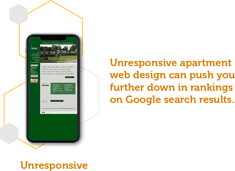
Additionally, unresponsive apartment web design can push you further down in rankings on Google search results. Google makes sure that the top search results on the page are all mobile-friendly and responsive.
Need some tips on how to make sure your multifamily website is responsive? Check out our blog here for more apartment web design tips.
Staying on Trend With Apartment Web Design
Apartment web design trends can shape everything from how designers create to UX design. They can also zoom in or fade out quickly, but we’ll be sure to update this blog regularly so you always have the latest scoop of what’s trending.
