What to Prioritize in Your Apartment Web Design
When multifamily websites first became prevalent, they were often just a bit more than digital brochures. As the internet has changed over the years, with greater and greater functionality and capabilities, multifamily websites are more important now than ever. It’s not enough to just use your site to showcase some base-level information on your property. Apartment web design requires a strategy and a thorough thought process.
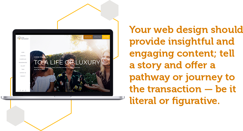
Your apartment web design must provide insightful and engaging content; you must tell a story and offer a pathway or journey to the transaction — be it literal (hello online leasing and virtual tours) or figurative (placing that call to tour the property). This can be overwhelming, especially when it comes to strategizing your multifamily website and more so, your first impression — the homepage.
The homepage of your website can make or break your online presence, so it’s important that every homepage highlight certain things about your property.
1. Tell your multifamily brand story.
No, you’re not writing a David Copperfield-style bio here, but you should showcase some information on your property and background. This can include simple multifamily branding — apartment logo and colors and imagery that reflects your community (e.g. amenities, units, and floorplans). A little reflection of your company culture can be nice, but don’t go overboard. Most people who visit your site won’t see that as a priority.
2. Pick a focus.
It can be tempting to cover all the information related to your property on the homepage — after all, it’s the page visitors will see the most. However, this will more often than not be a detriment to the success of your apartment web design. While you can talk about your property broadly, pick one thing to focus on — i.e., pick one focus for your call-to-action, be it a property tour or calling to talk to an agent about available units — then strategize your information around that.
Not only will your homepage be more clear for the user, but it allows you to prioritize a focus. Sure, you can still feature testimonials and other relevant information, but the key is to target this information back to your ultimate goal.
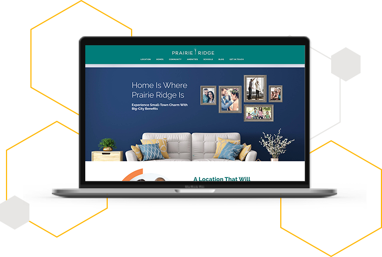
Let’s take the master-planned community Prairie Ridge as one example. While there are seemingly endless details about Prairie Ridge, Texas, that could be highlighted on the homepage — nearby schools, the benefits of the location, amenities, and details about the different home options — it maintains a clear focus on the mission, three simple benefits, and price range. This simple yet informative layout provides a cleaner look to the homepage, with several options for subpages with more information should the user want to dive into those topics on a deeper level.
3. Keep it simple and straightforward.
It can be tempting to get nuanced on your multifamily website. After all, you want to be seen as a leader in the industry. But the homepage is not the place to get super detailed with your knowledge.
More often than not, the people coming to your homepage are just starting out, and may not need that complicated information. They are likely in the research stage of their apartment home search and have come to your website to educate themselves about your property, amenities, and offerings.
Instead, you can use your blogs, deeper interior pages, offers, and forms to send the “thought leadership” information to the people who want it. Otherwise, expect to keep things at the “high-level” awareness level on your homepage optimization).
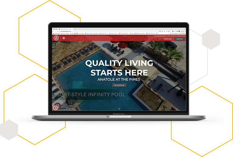
Another great example is Anatole at the Pines. The community homepage is straightforward in the best way possible with just a few paragraph sections highlighting important features about the property. The multifamily website also features a robust blog page, and several other subpages, that the user can easily access in the navigation bar. The blog page allows the property to share more in-depth details about the property and surrounding areas without overloading the homepage with excessive content.
4. Highlight your selling point.
This falls in a couple of areas, but it’s so important it should be emphasized on its own. What makes you different? This is part of your story, yes. It should also be part of your focus.
Your “remarkable” is the selling point of your business, and while it shouldn’t necessarily be the “sole” focus of your homepage, it should be heavily featured. Making your remarkable clear and easy to understand can make it easier to promote your property.
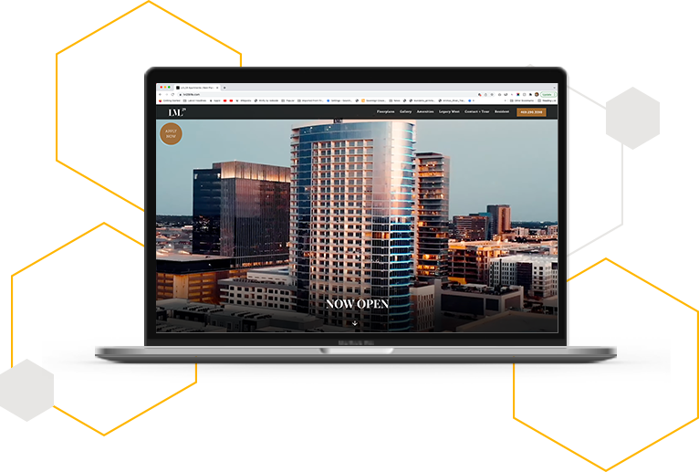
For example, luxury apartment community LVL 29’s significant selling point is its prime location in the bustling business district of West Plano, Texas in Legacy West. The live-work-play atmosphere in Legacy West is a “remarkable” for the property as it not only offers convenience and stunning views of Plano but it also offers a plethora of retail shops, dining, and entertainment options within walking distance of the property. This remarkable is made abundantly clear when you visit the LVL 29 website homepage.
5. Make your contact details prominent.
This should seem simple, but shockingly enough, many properties don’t do it well. How can a prospect get in touch? Don’t make people jump through hoops — instead, give a couple of ways in your apartment web design for prospects to get in touch, be it a form, phone number, or email. Your prospects will be happy, and your community will see strong returns.
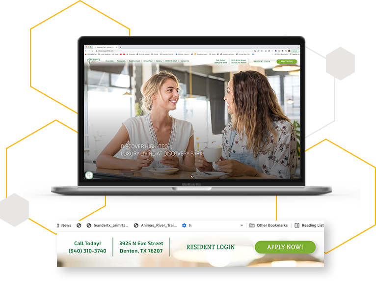
For example, when you visit the Discovery Park Apartments homepage, you immediately see the property’s contact information in the sticky navigation bar at the top of the page, a call-to-action to book a tour in a pop-up, and contact information again in the side navigation panel and at the bottom of the page.
Don’t make your residents wait until the very bottom of the page before they find your contact information. Unintentionally hiding your contact details could be the difference between earning the lease and losing an apartment lead (or several!)
Turn Your Multifamily Website Into a Second Leasing Office
Your multifamily website serves as your property’s virtual front door or a second leasing office. As such, it’s critical to ensure it’s optimized to convert more apartment leads into leases. Focus on a strong headline that packs a punch, keyword-targeted subheaders, a few short informative sections highlighting your selling points and top benefits. Make sure your contact information is easily accessible. With these tips in mind, your apartment web design will wow residents and increase conversions.
And if you need a little help getting this all set up for you, you know who to call! Swifty’s powerful apartment web designs offer speed, consistency, beautiful design, and affordability. Buzz on over and view our premium apartment website templates to see for yourself!


