
The Most Expensive Page on Your Site Is the One You’ve Stopped Looking At
The floor plans page is where renter intent peaks. It’s also where most apartment websites quietly hemorrhage leads.
Think about who’s on that page. They’ve already filtered by city, browsed a list of options, and decided your community looks worth a closer look. They’re standing at the door with their hand on the knob. And then they leave. Not because they didn’t like the unit layout. Because the thumbnail alone wasn’t enough to visualize their life at your property.
The floor plans page is one of the top three most-visited pages on nearly every apartment community website, right alongside the home page and the photo gallery. It’s where the lowest-funnel renters land. It’s also the page where the most decisions get made, silently, before anyone fills out a form or picks up a phone.
If a prospect bounces here, your marketing spend just delivered a qualified lead to your exit door. Every ad click that ends in a floorplans-page bounce is money you paid to lose them.
After looking at hundreds of multifamily floorplans pages, four patterns show up over and over. Each one has a fix.
Fix #1: Show What’s Actually Available Right Now
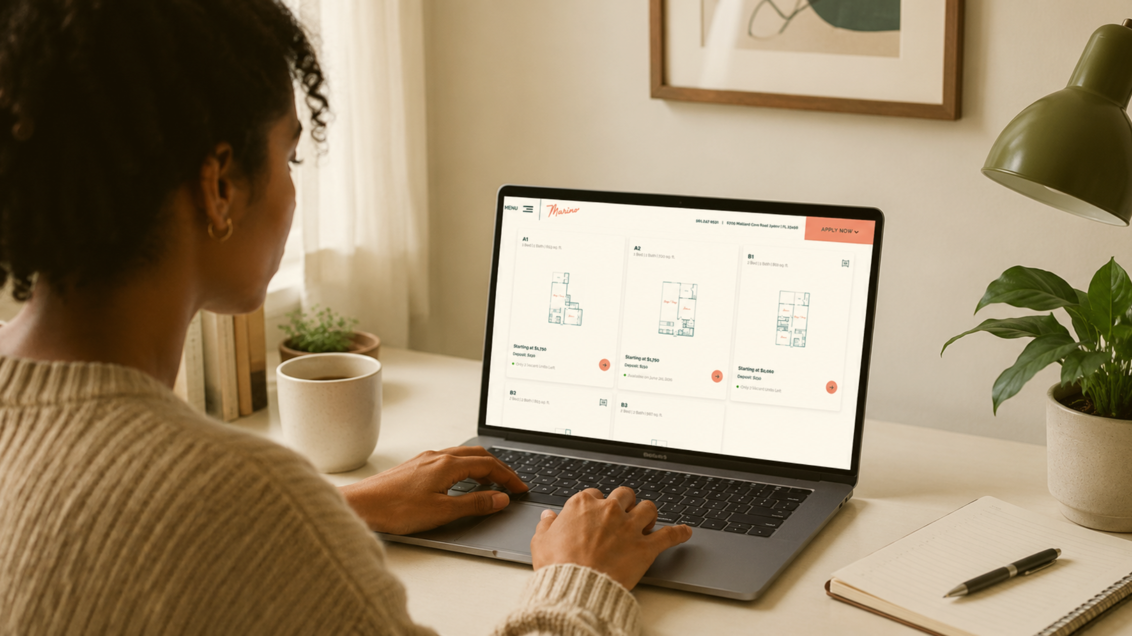
The most common floorplans page is a grid of unit types. The 1BR, the 2BR, the den layout, the corner unit. Each one with a “starting at” price.
The problem: “starting at” doesn’t tell a renter anything actionable. Are there any of these available? When? At what price today? If they have to call to find out, half of them won’t.
Renters are used to scrolling Apartments.com and Zillow, where live availability and live pricing are the default. When they land on your community site and it looks like a static brochure, you’ve just told them “this is going to be slower than the alternatives.”
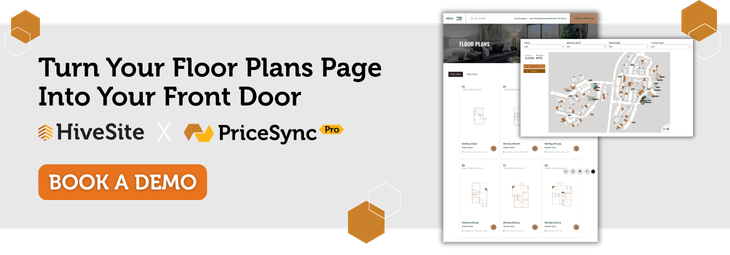
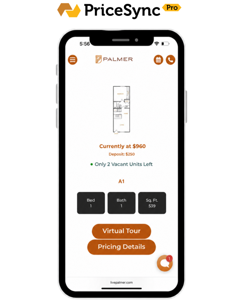
The fix: real-time availability and pricing on the floor plans page itself. Number of units available, move-in dates, and the actual rent for each one. Swifty websites handle this with PriceSync Pro, which pulls live pricing and availability straight from your property management system onto the floor plans page. If you’re on a different platform, the principle is the same: surface real data, not “starting at” placeholders.
Fix #2: Help Them Picture Where the Unit Actually Is
This is the big one, and it’s the one almost no apartment website does well.
A renter looks at a floor plan image and sees a layout. What they don’t see: where that unit sits on the property. Is it near the pool? Above the parking garage? Facing the courtyard or the highway? On the third floor or the ground floor? Right next to the dog park, or all the way at the back?
Floor plan images answer: “what does the inside look like?” They don’t answer: “where am I actually living?”
That second question is what drives the I can picture myself here feeling. Without it, renters either keep scrolling or default to scheduling a tour they may not actually take.
The fix: an interactive property siteplan. A map of your community that lets a renter click a unit and see its location relative to amenities, parking, entrances, and neighbors. Bonus points if it shows location awareness on mobile, so a prospect walking the property in person can see exactly where they’re standing.
This is what Swifty’s HiveSite does. It’s an interactive siteplan layer that drops into any apartment community website (Swifty-built or not) and turns the floor plans page into a real spatial experience. Click a unit, see exactly where it sits on the property, what’s around it, what floor it’s on. More on the full package below.
This is the single highest-leverage upgrade on a floorplans page. It collapses three or four pages of mental work into one visual.
Fix #3: Let Them Walk Through It Without Scheduling Anything
A 2D floorplan is a blueprint. Most renters can’t read blueprints. They see lines and labels and try to translate it into a feeling, and the translation usually fails.
3D floorplans, virtual walkthroughs, and high-resolution photo sets per unit type fix this. They let a prospect “tour” the unit at 11pm on a Tuesday, in their pajamas, before they’re ready to talk to anyone. That low-friction self-tour is what builds confidence. And confident prospects are the ones who actually show up for in-person tours and sign.
The fix: every floorplan should link to (or display inline) a 3D walkthrough or full photo gallery of that exact unit type. No clicks to a separate gallery page that’s organized by amenity instead of by unit.
Fix #4: Make It Not Painful on a Phone
The majority of apartment searches now happen on mobile. The majority of apartment floorplans pages are still built like desktop tables.
If a renter has to pinch-zoom to read a floorplan, tap a tiny “view details” link, wait for a modal to load, then go back to the grid to compare a second unit, they will not do that. They will leave.
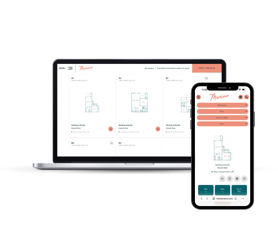
The fix: mobile-first filtering and comparison. Big tap targets. Filters at the top (bedrooms, price, move-in date, square footage) that update results instantly. A way to favorite or compare units without losing your place in the list.
This isn’t a design preference. It’s table stakes in 2026.
How Swifty Closes All Four Gaps
HiveSite covers the maps, walkthroughs, and mobile filtering. PriceSync Pro covers the live availability. Together, they give your floor plans page everything renters need to qualify themselves before they ever call leasing.
In one stack:
- Interactive siteplan maps with unit-level click-throughs, location awareness on mobile, and amenity overlays (HiveSite)
- Real-time availability and pricing pulled from your property management system (PriceSync Pro)
- 3D floorplans and virtual tour integration per unit type (HiveSite)
- Mobile-first search and filtering by price, move-in date, bedrooms, and square footage (HiveSite)
- Self-guided tour support so prospects can qualify themselves before they call (HiveSite)
The point isn’t that any one of these features is revolutionary. The point is that prospects need all of them working together to make a confident decision. HiveSite drops into any website you already have. PriceSync Pro plugs into Swifty-built sites.
The Bottom Line
The floorplans page is the most expensive page on your site. It has the highest cost per bounce. Every renter who leaves here had to be paid for twice: once to acquire, once to lose.
The fixes are concrete. Live data. A real map of the property. Walkthroughs. Mobile-first design. None of these are mysteries. They’re just rarely all in the same place at the same time.
When they are, the floorplans page stops being your exit door and starts being your front door.
Frequently Asked Questions
Does HiveSite require a Swifty-built website?
No. HiveSite is designed to drop into any apartment community website regardless of who built it. If you’re already on a different platform and don’t want to rebuild, HiveSite can sit on top of what you have.
What’s the difference between HiveSite and PriceSync Pro?
HiveSite is the interactive property experience: siteplan maps, 3D walkthroughs, mobile filtering, and self-guided tour support. PriceSync Pro is the live pricing and availability connector that pulls real-time data from your property management system onto the floorplans page. They’re a stack. HiveSite alone runs on any apartment website, and on Swifty-built sites the two are integrated together.
Do renters actually use interactive property maps?
Yes, especially on mobile. When renters can see where a unit sits relative to amenities, parking, and entrances, they spend more time on the floorplans page and are more likely to schedule a tour. The bigger the property, the bigger the lift, but even smaller communities see better engagement because the map answers a question floorplan images can’t: “where would I actually live?”
Can HiveSite work alongside the leasing tools and virtual tour software I already have?
Yes. HiveSite is built to layer on top of an existing website and integrate with the tools you’ve already invested in, including third-party virtual tour platforms and most major property management systems. It’s not a replacement for your leasing stack. It’s the connective layer that brings the whole experience together on the floorplans page.